Tuesday, 31 January 2017

Editing photos

Adding The Animation Theme

From my final video and looking at my photos on my bands website I felt that there was an element missing. During the production on my music video I used animation and was extremely proud of the outcome and overall effect that it gave to the Luna Music Video. It gave my clips a quirky and fun look which was perfect for my young band and the genre. Looking at the photos, I wondered whether if it would be a good idea to carry on the 'animated' theme onto some of the images.
 
I went onto premiere pro, picked some images I liked and began to edit the image on its own. I was happy with the overall outcome look of the images but I added the drawing lines to add something extra to my pictures. I kept a couple of the pictures in colour and added a matching colour drawing around the band member. On the more simplistic photos I changed the base colour to black and white and picked vibrant colours to draw and animate around the band member in order to make the person 'pop' and stand out from the image. Carrying on the theme from the music video was a good idea as it combines my products. This is often common to see in many artists' websites/music videos/digipaks.
 
In terms of genre, the pictures fit into the genre conventions perfectly. The image itself, being simple, having dual tone lighting and the band members wearing specific outfits all fit into the indie genre. It is the colourful animations around the band members that pull the whole image together and bring the pop genre aspect into the indie pop genre that my band is.
 
This simple effect was extremely affective on my images. The overall product will help highlight to whomever visits my website that I put together for the band what genre they are and will be able to link the images to the music video. Every element of the music video and photography fit together perfectly. 


Photo's and Photoshop Development DAY 2

Photo-Shoot Attempt 2


After the first attempt at my photoshoot of the two band members and changing some people best suited for my roles around, I became more clear to me as to how I wanted my photos to look and what I was going to edit. I turned to the internet for more inspiration and for cool lighting affects that I could transfer onto my own work. I came across images and videos that influenced my style of images. These videos and images were-


These images and video stood out to me and was something that I hadn't seen being used much in indie band photography. Seeing as I was using a hybrid genre band (indie-pop) I felt that it was appropriate to use these techniques as they had a pop-culture aspect and would help my indie 'basic' images stand out some more.

Therefore, I took to the internet, purchased a pair of Kaleidoscope glasses and asked my teacher whether if I could use the coloured gels with the lighting in the photography studio to take my bands photos.

The following photos are the raw and edited photos that I took with the DSLR Camera in the photography studio with the lighting and the kaleidoscope lens-
(19/02/17)


These images are how the majority of my photos came out. Some of these photos have been edited, some have been left natural. I enjoyed taking these photos as they look unique and make the band members pop out from the black background. They look unique, which makes the photos that I intend to use for my digipak, website and social media look different and extremely interesting. The images still stick to my Indie Pop genre. The way that the band are dressed, their expression, the black background are all elements that help portray to the audience that they are an indie band. The colours bring out the pop side of my indie-pop band. This particular style of editing and photography suits the  main genre that I picked for my fictional band.

Alongside the use of the kaleidoscope and coloured gels, I opted to go for a more common use of lighting and turned to the use of the soft box. These are the images I took-


I took these photos so that when I got to the editing stage I would be more free with whatever I wished to do with the images and keep my options open. I also wanted to keep the quality of the images if I was to add an affect on the images, therefore I chose to take the photos in a soft yet high-key lighting in order to achieve this. In the afternoon I took the images home and began editing the images on my laptop. I added black and white effects that were very fitting to the indie genre. I also added a faded out effect and increased the contrast on the images so that the background remained black. I also stuck to the indie genre conventions by adding a cold tint to the images.


Whilst taking these photos I kept the age of the demographic in mind. As I had previously studied the young indie pop band Ratboy I decided to mimic their young and rebellious images. The band members are seen making offensive hand gestures. This is extremely fitting for their age group and young and free image. Most indie bands are seen doing something rebellious, e.g. smoking and drinking. These images of the 17/18 year olds in my band were a way to portray this aspect of the band. Here are the edited images of the 3/5 members of the band.


Please do not take offence to these images. The images are purely for band image/school work purposes only.

These are some similar photos used by genuine music artists.

Years & Years- Indie Pop


Bastille - Indie Pop


Friday, 20 January 2017

Digipak Research 1

Digipak Research- Wolf Alice

What is a digipak?

A digipak is a style of packaging to protect CD's and DVD's. Typically, it is made from a thick laminated card that is laminated with UV to add a protective layer. This is their main purpose alongside to enhance the chance of sales and profits.

Digipak-style packaging is often used for special CD singles or special addition albums. Digipaks became popular in the 2000's due to the increase of CD sales. Digipaks can have many different styles, however, they all usually have 4 or 6 panels.


Thursday, 5 January 2017

Photo's and Photoshop Development DAY 1

Photo's and Photoshop Development DAY 1

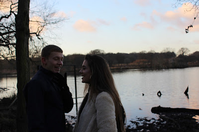
Recently, I went out to Richmond park with the lead singer of my made up band - Palms and his love interest (who will also be shown in the video) to take some photos whilst the sun was setting. Both myself and my other group member entered this particular task with an open mind as we were certain that we did not want any of the shots to seem awkward, artificial or staged. We chose to go by a lake as it is romantic as well as it being something appealing and scenic; we also asked the pair in the photos to act natural, which made the shots seem realistic. In the pictures, I wanted it to be as simple as possible yet of high standard and quality. This was done with the intentions of post production. When I and my other group member, came to editing the pictures we gained a rough idea of what we wanted to do next on our second day of shooting/filming as well as being able to manipulate the pictures as much as we would like without much difficulty. I decided that it would be a good idea to take pictures in a naturalistic mise-en-scene as it juxtaposes the modern people who are in the photos. I used a Cannon DSLR to take the photos and used various different setting in order to receive different outcomes and versions of the same photos.

Here are some of the original and un-edited photos taken on our first day of shooting.


When returning back to school, we resumed our work and began photo shopping and editing our photos to our required styles. I tried various different styles of photo shopping, but tried my best to keep within the indie genre and be minimalistic and artistic. Here are 3 of the photos which I edited, and I was extremely pleased with the outcome.


I used various different tools whilst using the software Adobe Photoshop CS6 to edit my shots. I mostly used the stamp tool to remove or add different objects in the shot which I believed would help alter and improve the quality of the image. An example of this was the boulders in the lake, and the tree in the background. I placed tints over some of the images and certain aspects of the images in order to make the image pop and to do something different that hadn't really been done before. This was key in order to add an element of interest to the image. I also improved the overall quality of the image by increasing elements of the photo such as the contrast, saturation, brightness and even added curves to the image which gave my shot the acquired look that I wanted it to have.


Next time, I plan to go to a studio to take images which will be of the whole band. I also plan to go to central London to take pictures in urban and rustic areas which will fit the Indie genre and make the band fit its typical stereotype- this is essential. I also plan to take minimalistic and natural pictures to get the same outcome as my first day of shooting as me and my other group member decided that we agreed that it was the key element as to why the final product/outcome of the pictures looked of a high standard.