Colour Grading
Here is a video of the colour grading that I did on various different clips of my music video for Luna. I used different effects depending on different parts of the music video. I split my music video into three different sections. The first section is the narrative section. This section is where I used a faded/cold tint on the image. The second section is the lip syncing section. This is where I added a black and white effect over the images. Finally the last section is with the band members each playing their musical instrument. There are various different reasons as to why I applied these effects onto different parts of the music video.
I wanted the parts of the music videos to display different meanings. If I had just kept the images clear and not changed the colour/quality of the images, I believe that the storyline and the parts with the band members would merge all together and not have such a clear narrative. With certain clips having a certain colour grade put onto it, viewers can piece the storyline together and gain a better understanding of the quirky and alternative indie-pop music video that myself and my partner put together.
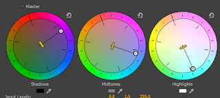
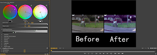
 For section 1 of my video (- the main storyline clips) I added a blue undertone and a white-blue and a pink tint to these clips. The reason for this was so that the video all fit together. Myself and my partner faced problems with the original look of the clips that we had put together. We decided to add this tint which made the video come together. When the clips weren't adjusted, the colours stood out and didn't look right. We also decided to add these particular colours as we thought that with the musical instrument section being colourful and mainly blue and pink (like the digipak) that it should be transferred onto the narrative clips as well. Again, it made the transitional cut shots look less harsh and fit within the genre. From my research of the indie genre, I gained an understanding of the different indie bands having a washed out/cold tint on their videos. I decided that this had to be added onto my own video as it was one of the main features of an indie music video. This was done by using the three-way-colour corrector.
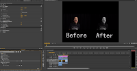
 Section 2 of my music video was clips of the band members individually singing parts of the song. I put a black and white effect on these particular images to create a contrast effect and to also stick to indie genre conventions. The black and white effect also added a more passionate look to the band members when they lip synced to the song. This in turn makes it more believable that they meant what they were singing and that it was 'Palms' that originally wrote and sang the song. The black and white mysterious yet passionate look added to the overall affect of the music video. The black and white affect added mystery and suspense. The two colours should hint to the audience that something is soon going to happen, therefore when the confetti is being poured over the band members, I increased the contrast and removed the black and white effect in order to make the confetti pieces stand out and glisten as much as possible. The black and white clips of the videos all had their brightness increased to 3 and contrast to 6. The lighting used whilst filming these clips was already good enough and made the clips look good quality, however I still felt that there was room for improvement. I added more contrast than brightness to make the black background look clean and have no shadows and to make the image look more crisp. The brightness was increased so that we didn't lose too much detail when the contrast was increased. This overall gave a crisp and good quality look on the lip syncing clips of my music video.
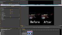
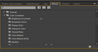
 Section 3 of the music video is the section with the band members playing musical instruments. It is these parts too that also have animation on the clips. As the animation was in a white colour I wanted the cool clips of the band members playing the instruments stand out even more and make the animation pop even more than it does on the narrative clips. I decided to add colour tints on to the video clips. I added primary colours such as blue, pink, red, green and added different undertones to each colour by spinning the outer part of the fast-colour corrector wheel. For example, in the music video I added a blue put gave a purple undertone to add more depth. In the drumming clip in the video above you will notice that I added a green tint to the video with a blue undertone. This made the clip look more interesting than just adding one simple colour on to the video. Alongside this I also changed the intensity of the colour that I added onto the video. I put a pink tint on the guitar clip and changed the intensity of the colour. I also added a brightness and contrast video affect onto the clip to make the background and black panel on the guitar as dark as possible, but I also increased the brightness to the clip so that you could see George playing the guitar clearly.


No comments:
Post a Comment